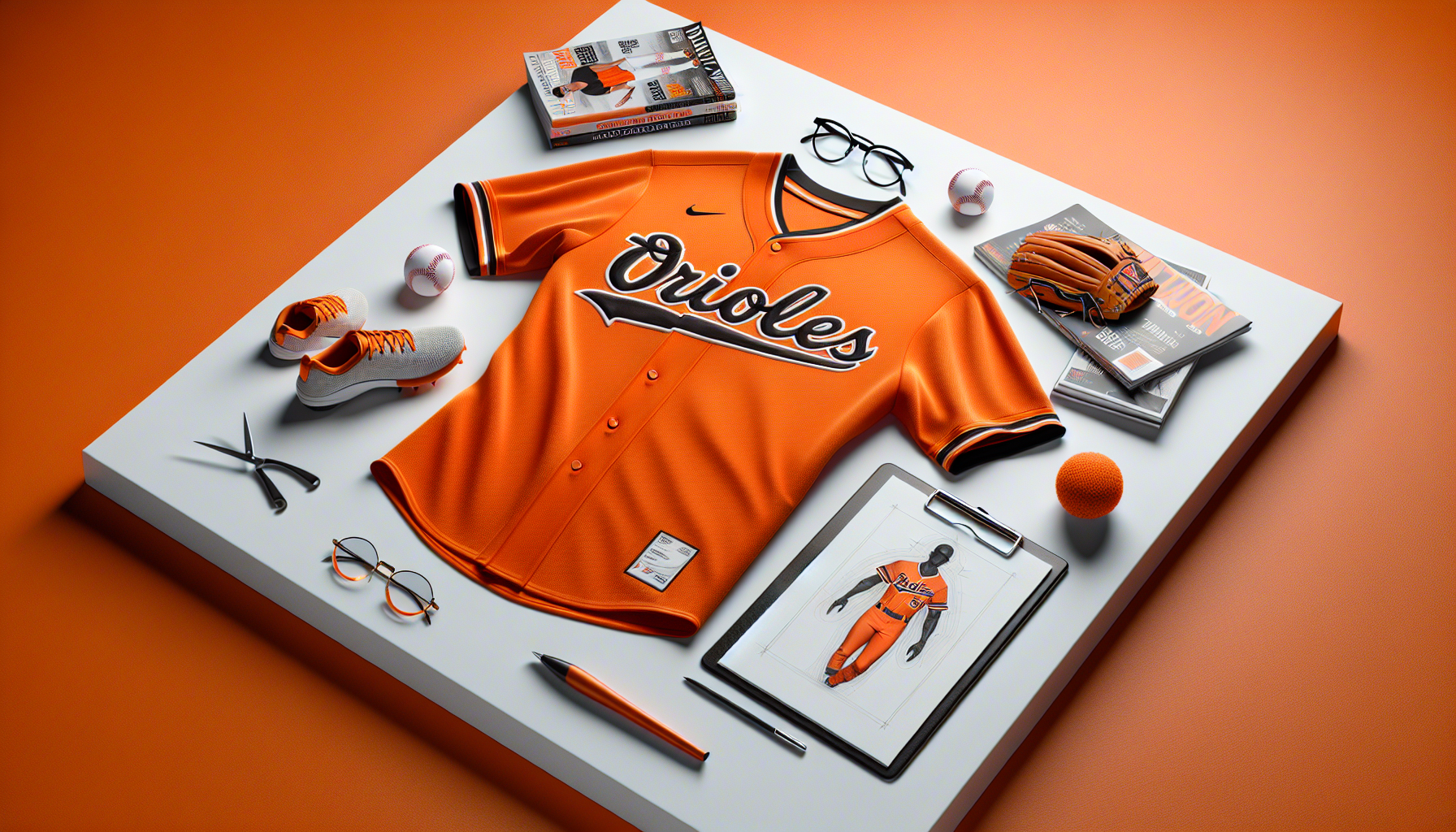
Orioles embrace tradition with all-orange return
The Baltimore Orioles are set to revive a striking part of their uniform history in 2025, bringing back their all-orange uniform combination. This bold monochromatic look, which has made sporadic appearances over the years, is a nod to the team’s deep-rooted tradition and identity. The decision reflects the Orioles’ commitment to honouring their past while maintaining a distinctive presence on the field.
First introduced in the 1970s, the all-orange uniform became an iconic yet polarising choice among players and fans alike. Over the decades, the Orioles have experimented with various uniform styles, but the bright orange ensemble has remained a memorable part of their visual identity. By reintroducing this look, the team aims to celebrate its heritage while embracing a sense of nostalgia for long-time supporters.
For the Orioles, the colour orange is more than just a design choice—it symbolises the team’s energy, passion, and connection to its fanbase. The return of the all-orange uniform is expected to be a key feature of the 2025 season, with players donning the vibrant kit for select games. While some may see it as a bold fashion statement, others view it as a tribute to the franchise’s storied past.
In Major League Baseball, uniform changes often spark discussion, and the Orioles’ decision is no exception. While some teams opt for modern redesigns, Baltimore’s move to bring back a classic look reinforces its dedication to tradition. Whether this revival will be met with widespread enthusiasm or mixed reactions remains to be seen, but one thing is certain—the Orioles will stand out on the field in 2025.
Fashion debate: A bold look or an eyesore?
The return of the Orioles’ all-orange uniform has reignited a long-standing debate in the world of sports fashion. While some view the monochromatic look as a bold and exciting statement, others argue that it borders on excessive. The uniform’s bright hue is undeniably eye-catching, but opinions are divided on whether it is a stylish choice or an aesthetic misstep.
Supporters of the all-orange ensemble praise its uniqueness and the confidence it exudes. In an era where many teams opt for conservative colour schemes, the Orioles’ decision to embrace such a vibrant look sets them apart. Fashion experts often highlight the power of monochrome outfits in making a strong visual impact, and in the world of sports, standing out can be just as important as performance on the field. The uniform’s striking appearance ensures that the Orioles remain instantly recognisable, reinforcing their brand identity.
However, critics argue that the all-orange look can be overwhelming. Some believe that the uniform lacks balance and subtlety, making it more of a novelty than a timeless design. The brightness of the colour, especially when worn from head to toe, has been compared to high-visibility workwear rather than a sleek athletic uniform. Detractors also point out that while orange is a key part of the Orioles’ identity, using it so extensively may not be the most visually appealing choice.
Beyond aesthetics, there is also the question of practicality. Brightly coloured uniforms can sometimes be distracting, both for players and spectators. Some fans have expressed concerns that the all-orange look may not translate well on television, where certain colours can appear overly saturated or washed out under stadium lighting. Additionally, in a sport where tradition plays a significant role, some purists argue that the Orioles should stick to more classic uniform combinations rather than revisiting a divisive design.
Despite the differing opinions, one thing is clear—the Orioles’ all-orange uniform is a conversation starter. Whether viewed as a daring fashion statement or an eyesore, it ensures that Baltimore’s players will command attention every time they take the field. As the 2025 season approaches, fans and analysts alike will be watching closely to see how the bold look is received both on and off the diamond.
Fan reactions and historical significance
For many Orioles fans, the return of the all-orange uniform is a nostalgic moment that brings back memories of past eras. The uniform was first introduced in the 1970s and became a defining look for the team during select games. Over the years, it has been worn by some of the franchise’s most legendary players, making it a symbol of Baltimore’s baseball heritage. While the uniform has not been a permanent fixture in recent seasons, its occasional appearances have always sparked excitement among long-time supporters.
Reactions to the announcement have been mixed, with some fans embracing the return of the bold look and others expressing reservations. Supporters argue that the all-orange uniform is a unique part of the Orioles’ identity and a refreshing departure from the more traditional designs seen across Major League Baseball. Many have taken to social media to share their enthusiasm, posting photos of past games where the team donned the vibrant kit and reminiscing about the excitement it brought to the ballpark.
However, not all fans are convinced. Some believe that the uniform is too flashy and prefer the Orioles’ classic white or grey combinations. Others recall past criticisms of the all-orange look, with some players and commentators describing it as overly bright or even distracting. Despite these concerns, the team’s decision to bring back the uniform suggests that it remains an important part of the Orioles’ visual identity, regardless of differing opinions.
Beyond fan reactions, the historical significance of the all-orange uniform cannot be overlooked. The Orioles have a rich history of uniform experimentation, and this particular design has been a recurring feature in the team’s wardrobe for decades. It represents an era when baseball uniforms were more daring and expressive, reflecting the personality of the team and its city. By reintroducing the look in 2025, the Orioles are not only paying tribute to their past but also reinforcing their commitment to standing out in the modern game.
As the 2025 season approaches, it remains to be seen how the all-orange uniform will be received on the field. Whether it becomes a fan favourite or continues to divide opinion, one thing is certain—it will ensure that the Orioles make a bold statement every time they step onto the diamond.
Orioles embrace tradition with all-orange uniforms
The Baltimore Orioles are set to revive their striking all-orange uniform combination in 2025, a move that pays homage to their rich history while making a bold visual statement. This monochromatic look, once a staple of the team’s wardrobe, is making a comeback, sparking excitement among fans and fashion enthusiasts alike.
For those who appreciate the power of colour in sportswear, the Orioles’ decision is a confident embrace of tradition. The vibrant orange hue is unmistakable, exuding energy and confidence—qualities that align perfectly with the team’s dynamic presence on the field. This isn’t just about nostalgia; it’s about reaffirming identity through fashion.
Historically, the all-orange ensemble has been a divisive choice, but its return signals a renewed appreciation for bold, statement-making uniforms. In an era where sports fashion is increasingly influenced by high-fashion aesthetics, the Orioles’ commitment to a single, striking colour palette is both daring and deliberate.
Monochrome dressing has long been a staple in high fashion, with designers frequently showcasing head-to-toe colour looks on the runway. The Orioles’ uniform revival taps into this trend, proving that even in the world of sports, fashion-forward choices can make an impact.
As the team steps onto the field in their signature shade, the question remains: will this be a triumphant return of a classic, or a polarising fashion moment? Either way, the Orioles are making sure they stand out—both in the game and in the style stakes.
Fashion debate: Bold statement or outdated look?
Orange is a colour that demands attention, but does an all-orange ensemble truly belong in the modern fashion landscape? The Orioles’ decision to revive their monochromatic look has sparked a debate that extends beyond the baseball field and into the world of style. While some see it as a fearless statement, others question whether this bold aesthetic is a relic of the past.
In fashion, head-to-toe colour dressing has been a recurring trend, with designers like Valentino and Stella McCartney embracing vibrant, single-hue looks on the runway. However, the key to making monochrome work is balance—playing with textures, silhouettes, and accessories to create depth. The Orioles’ uniform, while undeniably striking, lacks these nuances, making it a challenging look to translate beyond the sporting world.
For those who appreciate maximalism, the all-orange kit is a dream—unapologetically bright and full of personality. It aligns with the resurgence of dopamine dressing, where bold colours are used to evoke joy and confidence. But for others, the look may feel overwhelming, even verging on costume-like. Unlike the sleek, tonal dressing seen in luxury fashion, the Orioles’ approach is unfiltered and intense, leaving little room for subtlety.
Another factor to consider is the evolution of sports fashion. Many teams have embraced more refined, versatile designs that can transition seamlessly from the field to everyday wear. The Orioles’ all-orange uniform, while iconic, doesn’t offer that same adaptability. It’s a statement piece, but is it a wearable one?
Ultimately, fashion is about personal expression, and the Orioles are making theirs loud and clear. Whether this revival is seen as a bold triumph or an outdated misstep will depend on how the trend-conscious audience perceives it. One thing is certain—this look won’t go unnoticed.