Rothko’s influence on Sasaki’s vision
Satoru Sasaki’s latest collection is a vivid testament to the enduring influence of Mark Rothko’s work, particularly his exploration of colour as a vehicle for emotion. Rothko’s signature style—large, soft-edged rectangles of colour stacked atop one another—resonates throughout Sasaki’s designs, not as direct imitations but as conceptual echoes. The garments evoke the same meditative quality found in Rothko’s canvases, inviting viewers to experience fashion as a form of emotional expression rather than mere aesthetic display.
Rather than replicating Rothko’s palette or compositions, Sasaki channels the painter’s philosophy. Each piece in the collection is constructed with an awareness of space, proportion, and the psychological impact of colour. The designer’s use of bold, saturated hues—deep burgundies, burnt oranges, and moody blues—mirrors Rothko’s ability to create atmosphere through chromatic intensity. These colours are not decorative; they are integral to the narrative of each garment, functioning as emotional cues that guide the viewer’s response.
“I wanted to capture the silence and depth that Rothko’s paintings evoke,” Sasaki explained backstage. “There’s a stillness in his work that I tried to translate into fabric and form.” This approach is evident in the way colour fields are layered and juxtaposed, creating tension and harmony within each silhouette. The result is a collection that feels both grounded in art history and refreshingly contemporary, offering a new lens through which to view the intersection of fine art and fashion.
A fusion of minimalism and color
In this latest offering, Sasaki masterfully balances his trademark minimalist tailoring with a newfound embrace of colour, creating garments that are both restrained and expressive. The silhouettes remain clean and architectural—sharp-shouldered coats, columnar dresses, and fluid trousers—but they are now imbued with bold chromatic statements. Panels of saturated colour are strategically placed to enhance the structure of each piece, transforming simple forms into dynamic compositions.
Rather than overwhelming the viewer, the use of colour is deliberate and controlled. Sasaki employs a limited palette in each look, often focusing on two or three hues that interact in unexpected ways. A deep plum coat might be accented with a flash of ochre lining, or a slate-grey shift dress might feature a vertical stripe of cobalt that elongates the figure. These choices reflect a painterly sensibility, where colour is not just an embellishment but a fundamental design element.
“Minimalism doesn’t have to mean monochrome,” Sasaki noted during a post-show interview. “It’s about clarity of intention. Colour can be just as precise as a cut or a seam.” This philosophy is evident in the collection’s construction, where every seam and fold is considered in relation to the colour it intersects. The garments are engineered to highlight the interplay between form and hue, creating a visual rhythm that feels both modern and meditative.
The collection also experiments with texture to further explore the relationship between minimalism and colour. Matte wools, glossy silks, and sheer organzas are layered to create depth without clutter. These textural contrasts allow the colours to shift subtly under the light, adding a sense of movement to otherwise static shapes. The effect is quietly dramatic—an elegant tension between simplicity and complexity that speaks to Sasaki’s evolving design language.
Redefining abstraction on the runway
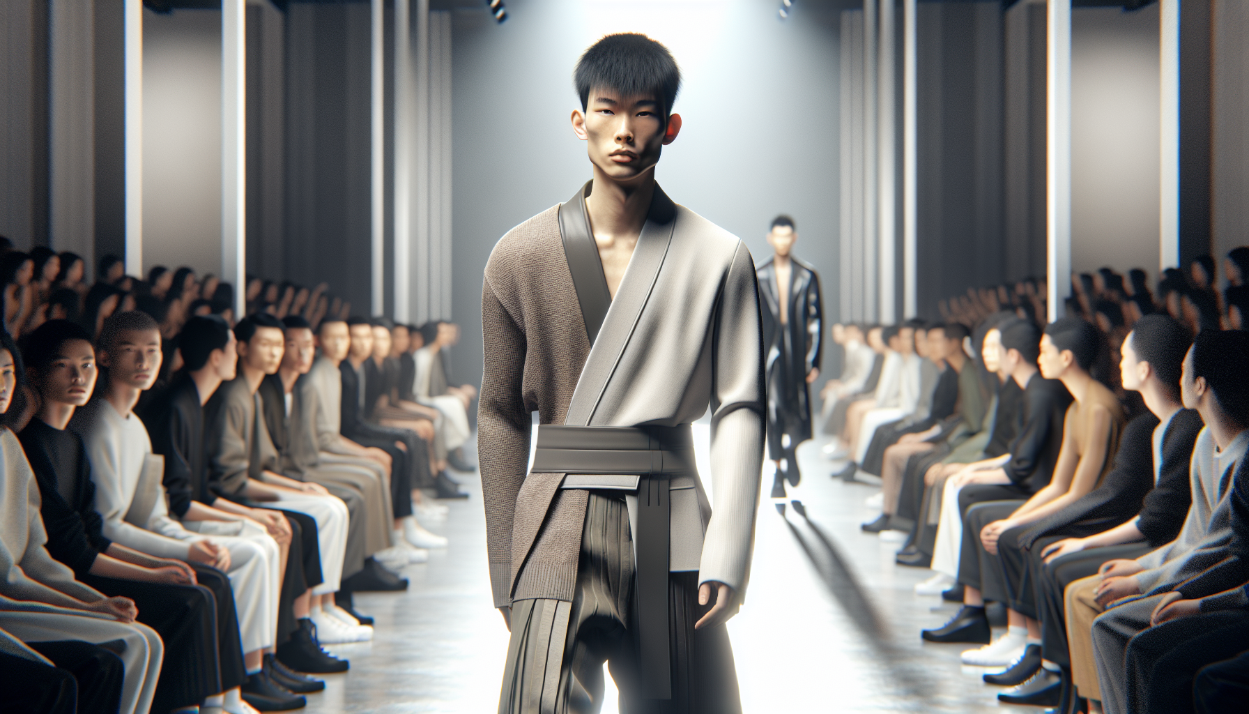
On the runway, Sasaki’s reinterpretation of abstraction took centre stage, not just in the garments themselves but in the way they were presented. Models moved with deliberate pacing, allowing the audience to absorb the interplay of colour and form in real time. The lighting was soft and diffused, casting gentle shadows that enhanced the depth of the colour blocks and the architectural lines of the clothing. This careful staging echoed the contemplative atmosphere of a gallery space, reinforcing the collection’s artistic underpinnings.
Each look functioned as a standalone composition, yet together they formed a cohesive narrative that challenged traditional notions of fashion presentation. Instead of relying on overt theatrics or elaborate styling, Sasaki let the garments speak for themselves. The abstraction was not only visual but conceptual—garments were stripped of extraneous detail, allowing the viewer to focus on the emotional resonance of colour and silhouette. This approach invited a more introspective engagement, encouraging the audience to interpret the pieces through their own lens.
“I see the runway as a canvas,”
Sasaki remarked. “It’s not just about showing clothes—it’s about creating an experience that lingers.” That experiential quality was palpable throughout the show. From the first look to the final exit, there was a sense of quiet intensity, a deliberate slowing down that contrasted with the often frenetic pace of fashion week. This shift in tempo allowed the abstraction to unfold gradually, revealing layers of meaning embedded in each design.
The collection also played with proportion and negative space in ways that felt distinctly modern. Oversized coats with exaggerated lapels were paired with slim trousers, while asymmetrical hems and unexpected cut-outs disrupted the symmetry of otherwise classic shapes. These design choices underscored Sasaki’s commitment to abstraction—not as a stylistic gimmick, but as a method of rethinking how clothing can communicate. The result was a runway show that felt more like a moving art installation than a conventional fashion presentation, pushing the boundaries of what fashion can be in a contemporary context.
Rothko’s influence on Sasaki’s color palette
Satoru Sasaki’s latest collection at Rakuten Fashion Week is a masterclass in colour theory, with a palette that unmistakably channels the emotional depth of Mark Rothko’s iconic canvases. The Japanese designer, known for his restrained silhouettes and architectural tailoring, has taken a daring leap into the world of expressive colour fields, layering rich hues in a way that feels both painterly and precise.
Each look on the runway echoed Rothko’s signature style—deep, saturated tones arranged in large, uninterrupted blocks. From burnt sienna and ochre to cobalt blue and crimson, the colours weren’t just decorative; they were central to the narrative. Sasaki’s use of colour became a language of its own, evoking mood and movement without a single embellishment.
It’s a bold shift for a designer rooted in minimalism, but one that feels entirely intentional. The garments maintained their clean lines and structured forms, allowing the colour to take centre stage. This interplay between form and pigment created a visual tension that was both modern and meditative—an homage to Rothko’s emotional resonance, reinterpreted through fabric and cut.
“I wanted the colours to speak first,” Sasaki shared backstage. “The shapes are quiet, but the colours are loud. That’s the balance I was chasing.”
For the Australian fashion market, where understated elegance often reigns, Sasaki’s Rothko-inspired palette offers a fresh perspective—one that invites women to embrace colour not just as an accent, but as a statement of identity and emotion.
Redefining minimalism through bold abstraction
Sasaki’s reinterpretation of minimalism doesn’t abandon its core principles—it redefines them through a lens of bold abstraction. The silhouettes remain pared-back and architectural, but it’s the interplay of texture, proportion, and colour that elevates each piece beyond the expected. Think column dresses in structured wool crepe, sliced with panels of saturated tangerine or deep plum, or oversized coats in monochrome navy punctuated by a single, stark stripe of chartreuse.
There’s a deliberate tension at play—between restraint and release, silence and statement. Sasaki’s garments are not loud in construction, but they command attention through their chromatic intensity and spatial awareness. The collection leans into asymmetry and negative space, allowing the eye to rest and then be jolted by a sudden burst of pigment or an unexpected cutaway.
For Australian women who favour a refined, effortless wardrobe, this collection offers a new kind of minimalism—one that’s emotionally charged and visually articulate. It’s a reminder that simplicity doesn’t have to mean subtlety. Sasaki’s pieces are designed to be worn with confidence, inviting the wearer to become part of the artwork.
- Tailored separates in bold, singular tones offer versatility with impact.
- Layering is key—sheer organza over matte jersey creates depth without bulk.
- Accessories are minimal, allowing the garments’ colour fields to dominate.
In a market like Australia, where trans-seasonal dressing is essential, Sasaki’s approach feels particularly relevant. The collection’s clean lines and breathable fabrics are ideal for layering, while the bold colour blocks inject a sense of drama that resonates with a fashion-forward, art-aware audience.